You using Photoshop?
Play around with the ‘Stroke’ in the effects options on your text.
It will outline around the text.
Try a black outline at 1 or 2 points value or maybe a deep maroon colour similar to the card colour.
See if that makes it stand out any more
Cheers Wotto.
Had a bit of a play.
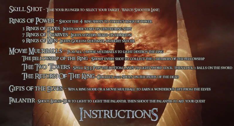
Here is the instruction card redone

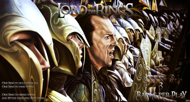
And I redid the ball card. This time with gradient overlay, inner glow and stroke.
